UI Color Palette Designer for iPhone and iPad
A whole interface palette from two sliders.
Drag hue and chroma, and a complete set of colours builds itself:
backgrounds, text, borders, actions and alerts. Every pairing that matters is graded against
WCAG as you go, and you can see the whole palette through four kinds of colour vision
deficiency before you ship it.
OKLCH generation
Live WCAG grading
Colour vision simulation
Real UI preview
CSS, SwiftUI and XML export
iCloud presets
OKLCH generation
Live WCAG grading
Colour vision simulation
Real UI preview
CSS, SwiftUI and XML export
iCloud presets
What the app does
A palette tool that generates the whole system, then checks it the way an auditor would.
01
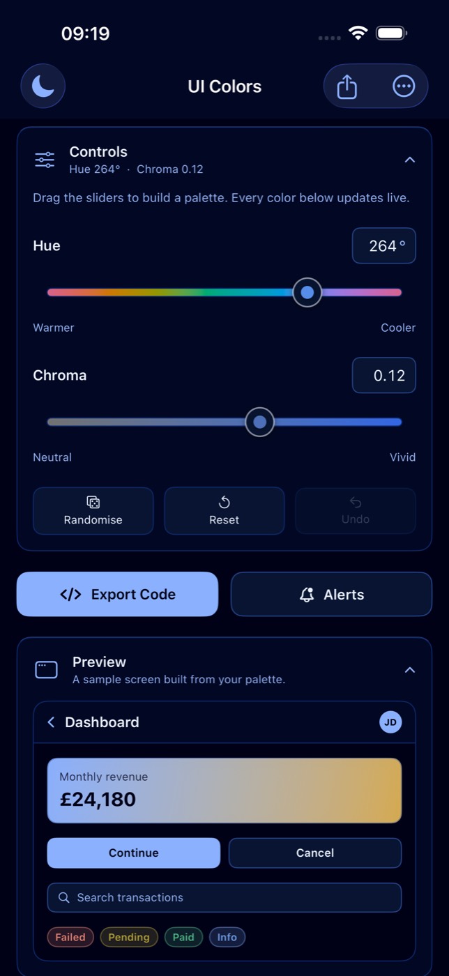
Two sliders, a whole system
Hue and chroma are the only controls. From those, the app derives backgrounds, text,
borders, actions and alerts as one coherent set, and everything updates live, so you watch
the system react as you drag rather than nudging swatches one at a time.
02
Built on OKLCH
Colours are generated in OKLCH, so lightness stays perceptually even across the palette.
Reds don't land darker than yellows, and every token keeps the weight you intended.
Out-of-gamut colours are mapped by reducing chroma, never by clipping the hue.
03
See it on real UI
A sample screen (nav bar, hero card, buttons, a search field and status badges) renders in
your palette while you work. It is the fastest way to tell whether a palette actually holds
up, rather than looking pleasant as a row of squares.
04
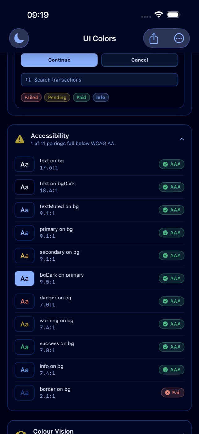
WCAG contrast, graded live
Every pairing that matters is scored against WCAG 2.1: text on background, muted text,
primary and secondary actions, and each alert colour. Each one is graded AAA, AA, AA Large
or Fail, with the exact ratio. You find out in the app, not in review.
05
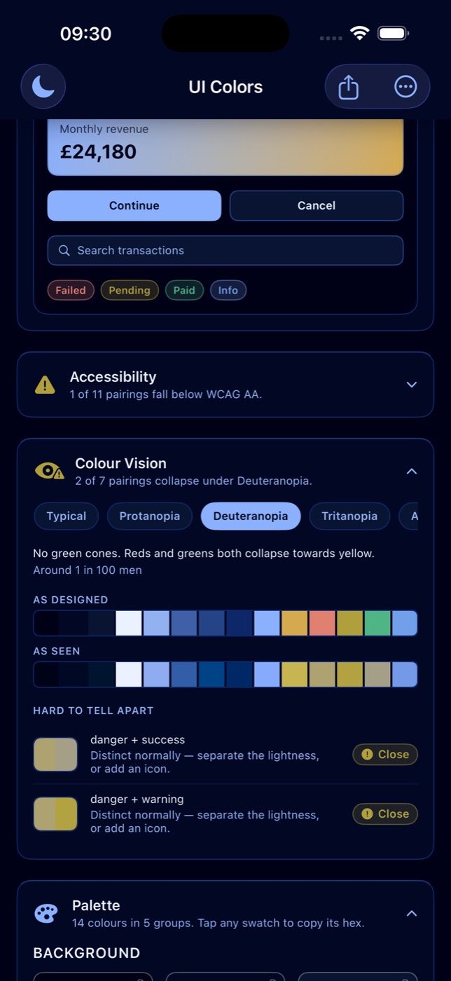
Colour vision, simulated
See the palette as viewers with protanopia, deuteranopia, tritanopia or achromatopsia see
it, side by side with the original. Any pair of meaning-carrying colours that stops being
distinguishable is listed, along with whether the deficiency caused it or the colours were
always too close, because the fix differs.
06
A workspace that folds away
Controls, preview, accessibility, colour vision and the palette itself all collapse, each
keeping a summary line while shut, so you can work on one thing at a time. Tap any swatch
to copy its hex, undo any edit, and switch light and dark one tap apart.
A look inside
Dense where the detail earns it, and quiet everywhere else.
On iPhone and iPad
Built natively with SwiftUI
UI Color Palette Designer is a native app built by Itch.studio, with the interface craft and
performance you expect from something made for the platform rather than ported to it. On
larger screens the controls and the palette sit side by side instead of stacking.
- Perceptually even palettes generated in OKLCH, with gamut mapping by chroma
- Live WCAG grading and colour vision simulation on the same screen as the palette
- Localised in nine languages, with no account, no tracking and no analytics
Getting it out of the app
A palette is only finished once it is in your codebase.
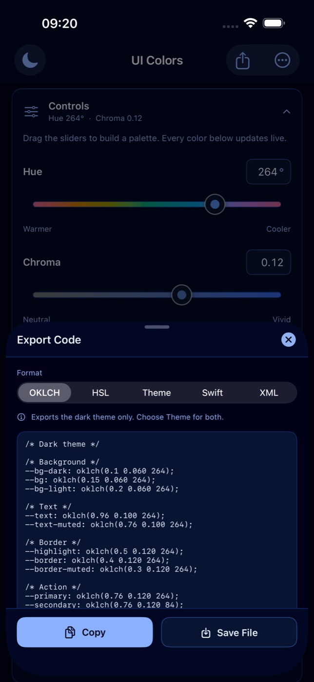
Every palette exports as real code for the platform you are building on,
ready to copy to the clipboard or save as a file. Generated comments stay in English on
purpose: exported code gets committed to other people's repositories.
01
Web
CSS custom properties, in OKLCH or HSL, or a full CSS theme with light and dark together in
one file.
02
Apple
A SwiftUI Color extension, with every token named exactly as it appears in the
palette.
03
Android
Android XML colour resources, dropped straight into your values folder.
Presets that follow you
Save a palette you like, rename it, and reapply it with one tap. Presets sync privately
through your own iCloud account, so they are on every device you sign in to without any
account of ours in the middle.
Share the palette
Render the whole palette as an image, save it to Photos, or send it to whoever needs to sign
it off. Alert colours can be previewed in context too, with their contrast alongside them.
Your data stays yours
The app has no account and no server of its own. Your presets and settings stay on your
devices and in your own iCloud. No tracking, no analytics, no data collection.
Nine languages
English, German, Spanish, French, Italian, Japanese, Korean, Brazilian Portuguese and
Simplified Chinese, including the contrast grades, colour vision descriptions and quick
actions rather than just the menus.